Views for WPF

Unique WPF controls and advanced panels that support fluid animated item layout

  • Numerous controls for building an application settings dialog
  • A task board control with reorderable columns and cards
  • A smooth-scrolling ScrollViewer variation that reacts to touch and supports flicks

Settings

Card, expander, and grouping controls for displaying configurable application settings.
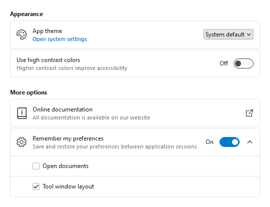
Application settings example
Various groups and cards for configuring an application's settings.

Consistent Appearance

Cards have a uniform design, and related cards can be grouped together. Each setting card can optionally have an icon, header, description, and content.

Card Contents

A setting card's content is generally an editor for the setting. The content may be left blank, and the card itself can be made into a clickable button.

Flexible Editors

Each setting card can contain any kind of editor control. Switches, sliders, combo boxes, and text boxes are commonly-used editor controls.

Expandable Sections

Some settings have numerous child settings. These indented settings may be hidden under expandable cards that animate the contents when opened.
Task Board

The TaskBoard control makes it easy to add interactive task scheduling and prioritization to your apps.

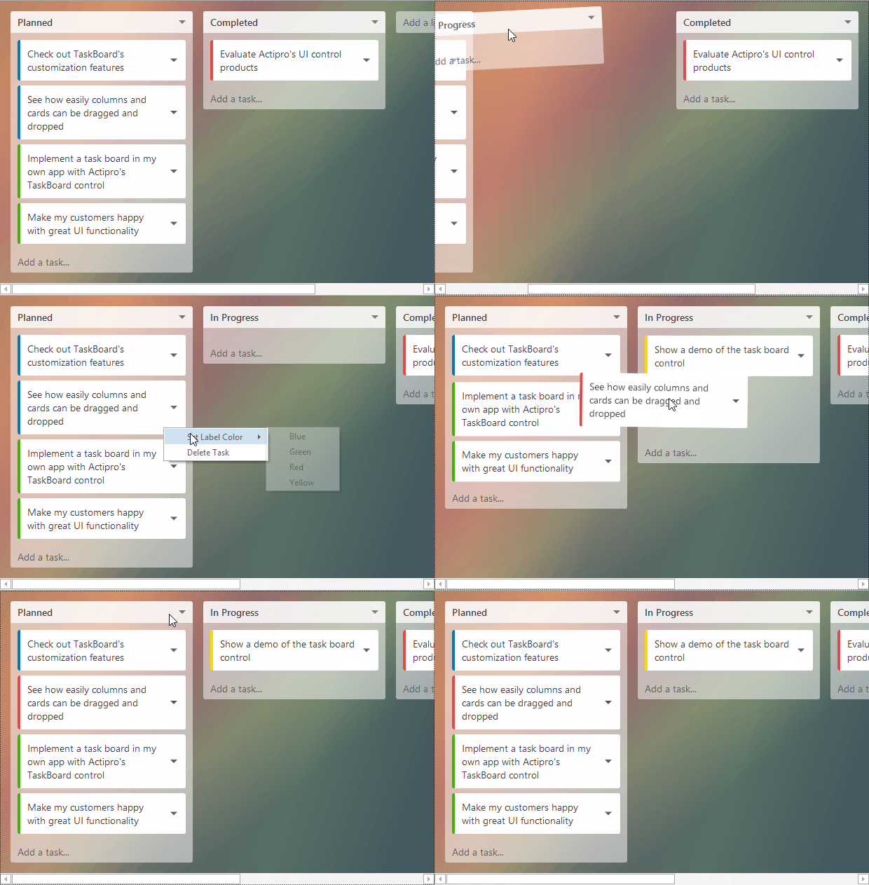
Task planning sample
Task board can create a task planning UI where tasks can be grouped and prioritized.

Layout

A task board consists of zero to many columns, each of which can contain zero to many cards. This kind of layout is commonly seen in kanban boards.

Drag and Drop

Columns and cards can be dragged around and reordered, all using pleasing sway animations. The drag and drop features can be disabled as a whole or dynamically on a per-instance basis.

Event Model

Events are raised that allow for notifications of drags/drops and even taps on cards. The event data includes detailed information about the current state and supports cancellation of certain events.

MVVM Support

The data model is completely MVVM friendly and makes heavy use of customizable item styles and templates.


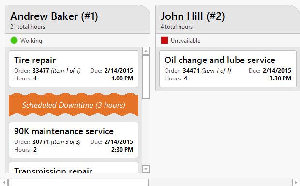
Repair shop scheduling sample
Task boards can also be used to prioritize a queue of work items for a resource, such as this example where each column represents an employee in an auto repair shop and each card is a work order.

Book

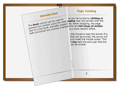
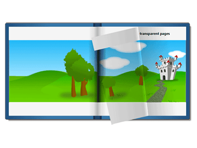
The Book control allows you to render any XAML content within its pages, including interactive UI controls, and offers a range of features.


Page Turn Animations

Page transitions are completely animated using sophisticated curling algorithms. Hot spot areas at the page corners curl towards the mouse and the page turn follows the mouse exactly like a real book’s pages would turn.

MVVM Support

The items/pages of the book can be specified explicitly or you can bind the book to an existing collection, including support for DataTemplates and Styles. The control is MVVM-ready.

Virtualization

The control supports UI virtualization, which increases performances and decreases memory. Enabled by default, only the pages required to render the view correctly are created.

The InertiaScrollViewer is a smooth-scrolling ScrollViewer-like control that reacts to touch and continues gliding to a stop when flicked.

Panels

Views includes unique panels, as well as drop-in replacements for several native panels that use fluid animations to arrange their child elements.

FanPanel

FanPanel

This panel positions its children along the z-axis with a focal element, which is always centered in the view. The x and y offsets, rotation, and fading can be customized, and child elements can animate into place.

ZapPanel

ZapPanel

This panel allows child elements to be positioned in sequential order, either horizontally or vertically, while keeping a focal item centered in the view. It includes support for wrapping items around, to produce a circular effect.

MultiColumnPanel

MultiColumnPanel

This panel renders child elements in multiple columns, collapsing columns down as available space decreases. It's a space-efficient and visually-appealing way to render lists of items, or to break paragraphs of text up.


Views also includes a number of panels that are drop-in replacements for the standard Canvas, DockPanel, StackPanel, and WrapPanel, and smoothly animate their child elements when the elements' layout positions change. These panels can be used as the items panel of any ItemsControl, like a ListBox. A SwitchPanel can delegate the positioning of child elements to one or more child panels, which allows the layout logic to be dynamically changed at runtime.

Controls

This product includes these UI controls, for use in applications built with the WPF platform:

AnimatedCanvas
AnimatedDockPanel
AnimatedStackPanel
AnimatedWrapPanel
Book
BookPage
FanPanel
InertiaScrollViewer
MultiColumnPanel
SettingsCard
SettingsExpander
SettingsGroup
SwitchPanel
TaskBoard
ZapPanel

Explore Other WPF Controls

Next Steps

Free Evaluation

The best way to learn about our UI controls and their features is to download a free trial. This will allow you to see samples, documentation, and integrate them into your own apps.

Download Trial

Need Help?

Do you have any licensing or sales questions? Do you have a technical question while evaluating? Please contact us so that our friendly staff can assist you.

Contact Us

Licensing

When your app's development team is licensed, you can distribute an app using our royalty-free UI controls to anyone. Our purchase page helps you calculate the licensing to meet your needs.

Purchase Licenses


Online Documentation

All product documentation topics and a complete API reference are available for browsing on our web site.

View Documentation

GitHub Repository

Clone our open-source repository on GitHub for the full source of the WPF Controls sample projects and documentation topics.

View Repository

NuGet Packages

Install product NuGet packages from nuget.org into any project, and easily update when new versions are released.

View Packages