Avalonia UI Controls v24.1 Released

by Avatar Bill Henning (Actipro)
Tuesday, May 7, 2024 at 1:12pm

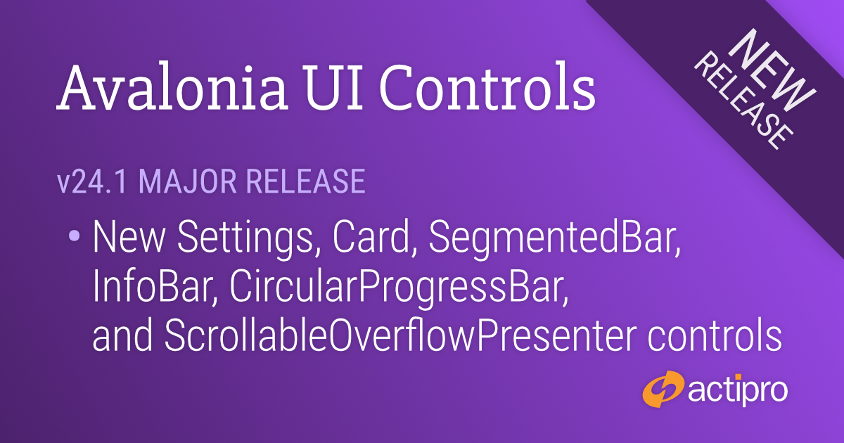
This version adds several great new controls and makes many updates across the Avalonia UI control product line.

See the related announcement post for the detailed list of enhancements and updates.

Download Buy Now

Here’s a look at some of the new features.

Fundamentals

Settings

Settings groups, expanders, and cards used for application settings UI

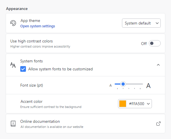
Most applications contain a window or view where end users can configure settings. Actipro now provides several controls for displaying grouped and optionally expandable card-based editors for settings that are presented in a consistent, easy-to-use way.

  • Consistent Appearance - Cards have a uniform design, and related cards can be grouped together. Each setting card can optionally have an icon, header, description, and content.
  • Card Contents - A setting card's content is generally an editor for the setting. The content may be left blank, and the card itself can be made into a clickable button.
  • Flexible Editors - Each setting card can contain any kind of editor control. Switches, sliders, combo boxes, and text boxes are commonly-used editor controls.
  • Expandable Sections - Some settings have numerous child settings. These indented settings may be hidden under expandable cards that animate the contents when opened.

Application settings have never looked so good!

Card

The new card control presents visually grouped information for a single subject, using optional cover, thumbnail, header, and footer sections.

A profile card with multiple sections

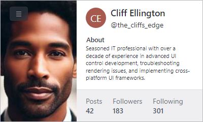
Cards can optionally be actionable as well.

Segmented Bar

The new segmented bar control allows a user to select a single item with support for fluent animations when changing selection.

Several theme variants

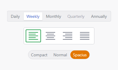
It can arrange items horizontally or vertically.

Info Bar

The new info bar control displays essential information to a user without disrupting the user flow.

Various kinds of info bar severities

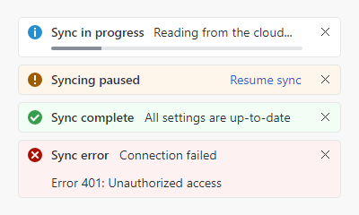
Messages can display with optional severity, action, and more.

Circular Progressbar

The new circular progressbar control displays a ranged progress value using fluent animations. It is similar to a native linear progressbar, except that it renders the progress in a ring shape and shows the progress text within the ring.

Circular progressbars can be an integral part of a dashboard display

An indeterminate state is supported for scenarios where no specific progress value can yet be determined.

Shared Library

Scrollable Overflow Presenter

The new scrollable overflow presenter control can be oriented horizontally or vertically and displays scroll buttons when its content overflows the available space.

A horizontal scrollable overflow presenter with overflow button displayed

Clicking a scroll button smoothly scrolls the content.

Themes

Toggle Switch Affinity

Toggle switches can now optionally arrange the knob/track on the right side of the control instead of the left, which is ideal when used in the new settings-related controls.

Avalonia

The minimum Avalonia UI dependency is updated from v11.0.5 to v11.0.7 and all native control themes should now be consistent with Avalonia UI’s theme updates through v11.0.10.

WinForms Controls v24.1 Released

by Avatar Bill Henning (Actipro)
Tuesday, February 27, 2024 at 3:40pm

This version adds a new Visual Studio Blue renderer, makes major improvements to SyntaxEditor’s ability to support light and dark themes, improves the SyntaxEditor .NET Languages Add-on, and much more.

See the related announcement post for the detailed list of enhancements and updates.

Download Buy Now

Here’s a look at some of the new features.

Renderer Updates

Some of the renderers for the various WinForms controls have been refactored with a more modern appearance, such as with glyphs for the status bar gripper and menu item checks.

The new Visual Studio Blue theme

A new Visual Studio Blue renderer has been added that mimics the look of the Visual Studio 2022 Blue theme.

SyntaxEditor Light and Dark Themes

It’s easier than ever to support switching between light and dark themes in SyntaxEditor.  A new class helps orchestrate updating SyntaxEditor UI elements, highlighting styles, and icon sets when toggling between light and dark themes.

A SyntaxEditor light theme (above) and dark theme (below)

All Actipro-provided syntax languages now include both light and dark highlighting styles, and we automatically convert many popular light-themed colors to appropriate dark-themed colors for custom languages that have yet to be updated with explicit dark styles.

SyntaxEditor Highlighting Style Updates

The current line number is now highlighted in a different style than other line numbers, so the default line number colors have been updated to better suit this feature.

Multiple carets and current line highlighting

When using multiple carets while editing, the primary caret now has a more distinctive appearance than secondary carets.

Several other highlighting styles have also had their default values tweaked.

SyntaxEditor .NET Languages Add-on Updates

The C# parser grammar has been updated to support C# 9.0 syntax, including everything from top-level statements to records and improved pattern matching.

A C# document with top-level statements

Resolver support has been improved for local functions.

Documentation comments display in IntelliPrompt now supports <para> and <br/> tags for paragraph and line breaks.

Sample Browser

The Sample Browser application has been updated to use an SDK-style project and target .NET 6.

WinForms Controls v23.1 Released

by Avatar Bill Henning (Actipro)
Tuesday, February 7, 2023 at 10:01pm

This version contains updates across all our WinForms controls to support high DPI environments and add new dark color schemes.  .NET version compatibility was modernized to the latest supported .NET versions, and a large number of other various feature additions and bug fixes were made to all products.

SyntaxEditor with the Metro Dark color scheme

See the related announcement post for the detailed list of enhancements and updates.

Download Buy Now

Here's a look at some of the new features.

DPI Awareness

Historically, high DPI support in WinForms has been a mixed bag. Newer Windows API’s and recent updates to .NET have greatly improved the scenario, but high DPI support is still not free and developers must put in the effort to ensure proper DPI awareness.

How numerous Actipro WinForms Controls render in 200% DPI with the v23.1 updates

With our WinForms Controls v23.1 updates, we’ve done our part to make sure our controls can render correctly in high DPI environments. Some of the changes include:

  • Scale font sizes.
  • Scale control dimensions.
  • Scale glyphs.
  • Scale raster images using optimal technique for the scale factor (e.g., pixel doubling at 200% dpi).
  • Scale built-in dialogs.
  • New vector-based common images for SyntaxEditor IntelliPrompt.
  • New DPI-friendly dock guides for Docking.
  • New DpiHelper class to simplify scaling based on DPI.
  • Updated Sample Browser to be DPI-aware.

NOTE:  Anyone with a DPI-aware application needs to read our v23.1 conversion topic and thoroughly test. It could be that you were already compensating for lack of DPI-awareness that we now handle, so you don't want to do something like scale our controls if we're already scaling them (causing double scaling).

Dark Color Scheme

We’ve also revamped how all renderers determine which colors are being used so we can better support a dark color scheme. New “Metro Dark” renderers are available for all our products and can be used to better integrate with dark-themed applications.

.NET Compatibility Updates

In regards to .NET version compatibility, we have:

  • Validated that v23.1 works great with .NET 7.
  • Updated our .NET 5 targets to .NET 6, since that is the lowest supported version of .NET per Microsoft.
  • Updated our .NET Framework 4.0 targets to .NET Framework 4.6.2, since that is the lowest supported version of .NET Framework per Microsoft.

WPF Controls v22.1.3 Maintenance Release

by Avatar Bill Henning (Actipro)
Thursday, September 8, 2022 at 9:04pm

This version makes a number of SyntaxEditor improvements including the abililty to select the next occurrence of selected text, much faster performance with complex IntelliPrompt completion lists, indented word-wrapped lines, and more.  Other updates have been made to Docking/MDI, Editors, Grids, Ribbon, Themes, and the Shared Library.

See the related announcement post for the detailed list of enhancements and updates.

Download Buy Now

Here's a peek at a couple of the new features...

Docking/MDI

Tabbed MDI Float All

A new "Float All" menu item has been added to documents in tabbed MDI. 

The new menu item (left) and the result of clicking it (right)

When clicked the documents float together into a new MDI window that can be dragged as a group to another monitor.

SyntaxEditor

Select Next Occurrence

The select next occurrence feature provides a quick way to select additional instances of the selected text.  Say our caret is in the middle of the "using" keyword.  Pressing Ctrl+D (the hotkey for Select Next Occurrence) will select the current word since no selection was yet available.

A sequence of screenshots showing the Select Next Occurrence feature

After pressing Ctrl+D once a selection is made, it will add another selection of the next instance of the selected text.  In the bottom screenshot in the sequence above, I've pressed Ctrl+D several times so that all instances of "using" are selected.

SyntaxEditor supports multiple carets and selections, and at this point, any typing will update all the selected instances at the same time.

Indented Word-Wrapped Lines

Another great new feature is that word-wrapped lines will now be indented by a couple characters, as long as there is sufficient editor width to do so.

The wrapped portion of line 11 is indented

In the screenshot, you can see how the word-wrapped portion of line 11 is indented a couple characters beyond line 11's anchor indent level.  Indentation of wrapped lines makes it easier to read them.

The indent amount is fully configurable via a new SyntaxEditor.WrappedLineIndentAmount property, whose default is 2.  Set it to 0 to indent to the same amount as the anchor line with no additional indent.  Or set it to -1 to always left-align wrapped lines within the text area (no indent at all).

Themes

Theme Designer Base Color Finder

The Theme Designer has a handy Base Color Finder tool that can find a color family that will match your brand's primary color.  Previously this only worked well for light themes.  Updates have been made so that dark themes are also supported.

The Base Color Finder working on a dark theme

UI Controls v22.1 Maintenance Releases

by Avatar Bill Henning (Actipro)
Wednesday, June 1, 2022 at 6:56pm

These maintenance releases for our WPF, WinForms, and UWP Controls focus on making many minor improvements across all the products.  In addition, WPF's WindowChrome now allows it to render a backdrop with Mica or Acrylic materials when on a Windows 11 system.

A WPF Window with a WindowChrome Acrylic backdrop applied

See the related announcement posts for the detailed lists of enhancements and updates:

Download Buy Now