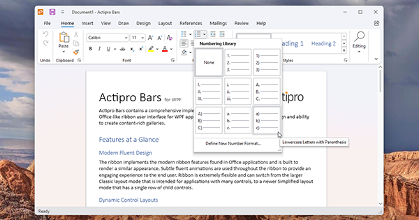
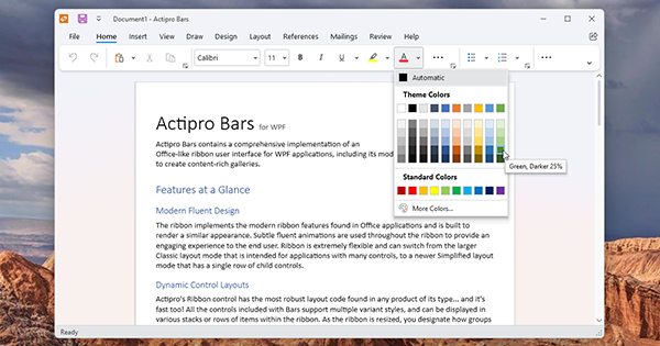
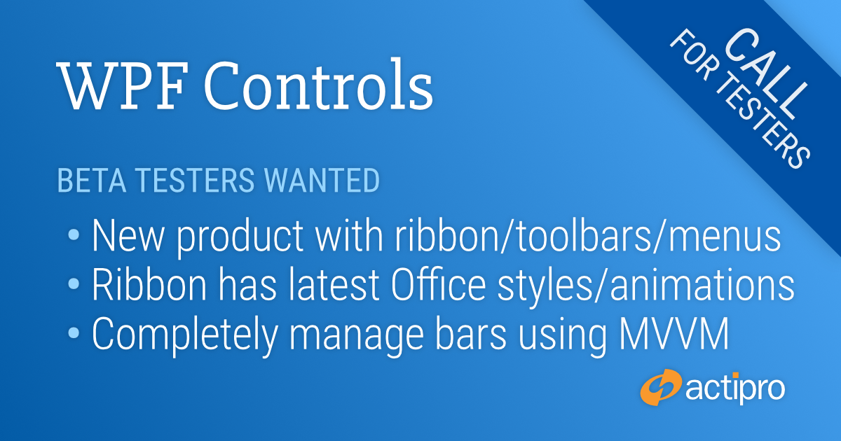
We’ve very excited to announce our new WPF Bars product that has been in development for quite a while now. Bars comes packed with everything you need to implement advanced ribbons, toolbars, and menus in your WPF applications.
The Bars Ribbon in Classic layout mode showing a custom gallery
This first beta release of Bars includes a powerful new Ribbon control that has the latest Office appearance with subtle animations, is extremely customizable, and makes it easy to build custom galleries. A StandaloneToolBar control can be used as a window's main toolbar or can be enclosed within a tool window. Future planned updates for Bars will add docking toolbar functionality. Everything from popup/split buttons to comboboxes to galleries can be included anywhere in a ribbon, toolbar, or menu.
An open source Bars MVVM library implements a complete set of view models and related UI views for building a full ribbon hierarchy in code. It also includes multiple examples of building visually stunning galleries that are seen in Office.
The same window but with the Bars Ribbon switched to Simplified layout mode
The new Ribbon control implementation in Bars was built from the ground up with WPF best-practices in mind. It supports MVVM usage, has fluent animation throughout, allows instant switching between Classic (three row) and Simplified (modern single row) layout modes, uses simple control variant logic when resizing, has better a control infrastructure, includes a full UIA peer tree, and that’s just scratching the surface.
We think you will love using the new Bars product in your WPF applications, and we can use your help. Bars will ship in the WPF Controls v23.1 release and we are nearing release candidate stability for the product. We would like to have additional customers take it for a test drive to provide us feedback.
If you would like to assist in testing a preview build of Bars in v23.1, please write us at our support e-address and describe how you might use Bars in your applications. We look forward to hearing from you.
This version makes a number of SyntaxEditor improvements including the abililty to select the next occurrence of selected text, much faster performance with complex IntelliPrompt completion lists, indented word-wrapped lines, and more. Other updates have been made to Docking/MDI, Editors, Grids, Ribbon, Themes, and the Shared Library.
See the related announcement post for the detailed list of enhancements and updates.
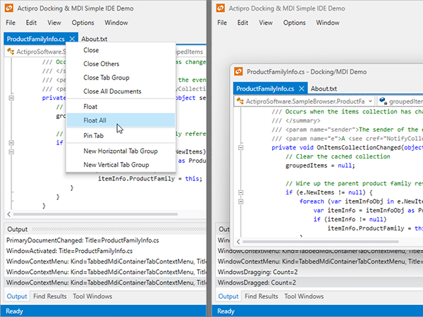
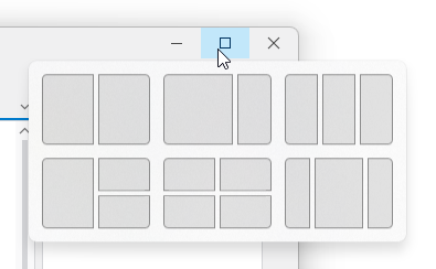
A new "Float All" menu item has been added to documents in tabbed MDI.
The new menu item (left) and the result of clicking it (right)
When clicked the documents float together into a new MDI window that can be dragged as a group to another monitor.
SyntaxEditor
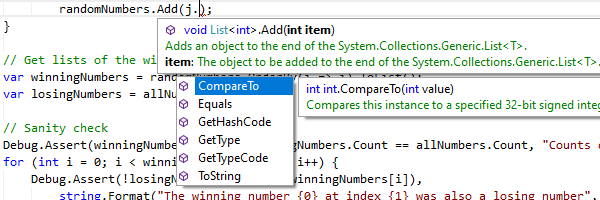
Select Next Occurrence
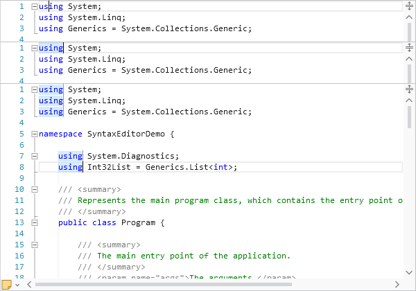
The select next occurrence feature provides a quick way to select additional instances of the selected text. Say our caret is in the middle of the "using" keyword. Pressing Ctrl+D (the hotkey for Select Next Occurrence) will select the current word since no selection was yet available.
A sequence of screenshots showing the Select Next Occurrence feature
After pressing Ctrl+D once a selection is made, it will add another selection of the next instance of the selected text. In the bottom screenshot in the sequence above, I've pressed Ctrl+D several times so that all instances of "using" are selected.
SyntaxEditor supports multiple carets and selections, and at this point, any typing will update all the selected instances at the same time.
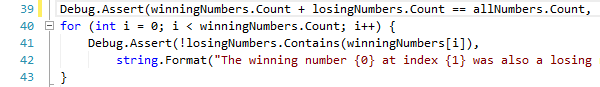
Indented Word-Wrapped Lines
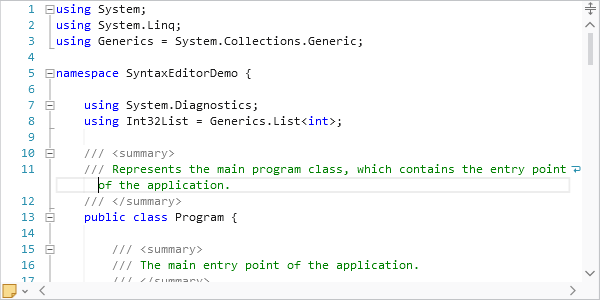
Another great new feature is that word-wrapped lines will now be indented by a couple characters, as long as there is sufficient editor width to do so.
The wrapped portion of line 11 is indented
In the screenshot, you can see how the word-wrapped portion of line 11 is indented a couple characters beyond line 11's anchor indent level. Indentation of wrapped lines makes it easier to read them.
The indent amount is fully configurable via a new SyntaxEditor.WrappedLineIndentAmount property, whose default is 2. Set it to 0 to indent to the same amount as the anchor line with no additional indent. Or set it to -1 to always left-align wrapped lines within the text area (no indent at all).
Themes
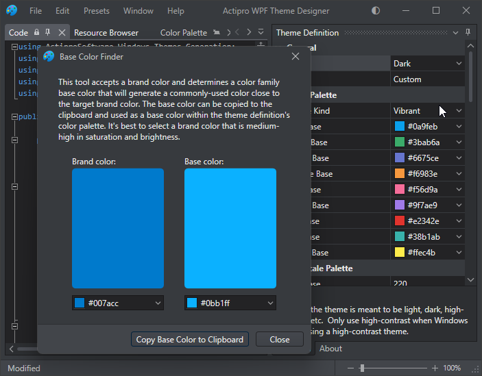
Theme Designer Base Color Finder
The Theme Designer has a handy Base Color Finder tool that can find a color family that will match your brand's primary color. Previously this only worked well for light themes. Updates have been made so that dark themes are also supported.
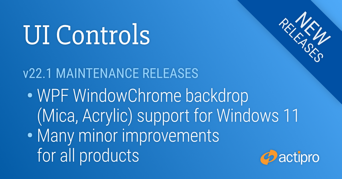
These maintenance releases for our WPF, WinForms, and UWP Controls focus on making many minor improvements across all the products. In addition, WPF's WindowChrome now allows it to render a backdrop with Mica or Acrylic materials when on a Windows 11 system.
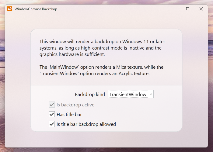
A WPF Window with a WindowChrome Acrylic backdrop applied
See the related announcement posts for the detailed lists of enhancements and updates:
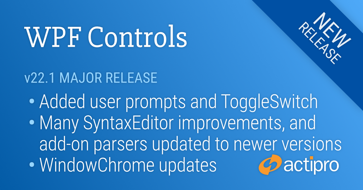
This version includes new controls, new WindowChrome features for Windows 11, many improvements for SyntaxEditor and its add-ons, updates to nearly all WPF products, and now includes .NET 5 assemblies in the NuGet packages with validated .NET 6 compatibility.
See the related announcement post for the detailed list of enhancements and updates.
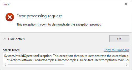
Added a rich API that can create modern, themed dialogs for anything from simple messages and confirmations, to more advanced scenarios like exception notification dialogs or file copy dialogs.
An example exception dialog with multiple optional sections, all of which can be configured to any custom content
We even include a ThemedMessageBox object with static methods that match the native WPF MessageBox API. Our themed version of the MessageBox uses a chromed WPF Window instead of Win32 dialogs (as the default WPF MessageBox does), along with fluent icons. This is important when your app is in a dark theme because it allows all message/confirmation dialogs to match the theme. You can instantly modernize all message box display in your app to our implementation with a single line of code too.
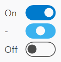
ToggleSwitch
Added a new control that is often seen as a replacement for a traditional CheckBox in modern user interfaces.
The three available states in the default ToggleSwitch style
It's easy to customize the appearance of ToggleSwitch to support other styles as well.
PopupButton
Made numerous updates to PopupButton to improve focus handling, tooltip display, key handling, and knowing when to close itself.
Themes
WindowChrome Windows 11 Support
WindowChrome has added support for Windows 11 where it will use rounded corners and system-rendered drop shadows. In addition, hovering over the title bar's Maximize or Restore buttons will show the Windows 11 Snap Layout menu.
WindowChrome now renders Windows 11 windows with rounded corners, system drop shadows, and supports the Snap Layout menu
SyntaxEditor
Synchronization QuickStart
A new sample demonstrates synchronizing the scroller and splitter of one editor instance with another.
Drag and Drop
Improved drag/drop interaction and related scrolling in several scenarios, and add a new Drag and Drop QuickStart sample.
Single-Line Mode QuickStart
Added a formula example with alternate style for nested parentheses.
Styles that highlight nested parentheses
Editing and Caret Movement
Made many small improvements in the areas of editing and caret movement, especially in certain special contexts.
IntelliPrompt
Improved popups to reposition themselves as the editor is scrolled.
Multiple IntelliPrompt popups
Vertical Scrolling
The vertical scrollbar has been updated to handle collapsed regions more smoothly.
SyntaxEditor .NET Languages Add-on
C# Parser
Updated to support C# 8.0 syntax.
Go To Definition QuickStart
A new sample that demonstrates using an IResolver to navigate to the source of a reference.
C# Outlining
The outliner will now create nodes for code-level constructs such as block statements by default.
Code outlining now works on blocks, like 'for' statements
SyntaxEditor Web Languages Add-on
JavaScript Parser
Updated to support ECMAScript 2021 (12 Edition) syntax.
JSON Syntax Language
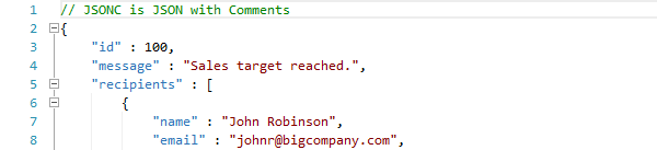
Added a constructor for whether the language should support JavaScript style comments, as in Microsoft’s JSONC variant.
Optional JavaScript comment support in JSON
SyntaxEditor Python Language Add-on
Python Parser
Updated to support Python v3.9.5 syntax.
Python Resolver
Updated to support namespace packages.
Grids
FilterApplied Event
Added a FilterApplied event that is raised after the current filtering state has been applied to all of the control's items, generally occurring when DataFilter is changed, or filtering is enabled or disabled
TreeListBox Updates
Added a new item adapter method that can improve performance in large trees when searching for a tree node, and improved focus tracking and filtering.
Editors
Commit Trigger Changes
Updated edit box commit triggers so that commit on focus loss is now optional.
Improved Cultural Support
Updated the numeric edit boxes to support input of Full-width and Arabic-Indic digits.
Charts and Micro Charts
New Aggregation Kinds
Added SignedMaximum and SignedMinimum aggregation options that compare against absolute values while retaining the sign of the original value; e.g., -5 is greater than 4.
Projects that target .NET 5 or later will use the .NET 5-based assemblies, and projects that target .NET Framework 4.5.2 or later will use the .NET Framework 4.5.2-based assemblies.
.NET 6 Support
We’ve also validated that our assemblies work great in .NET 6 applications.
 Bill Henning (Actipro)