WPF, Silverlight, and WinRT/XAML v2014.1 Released

by Avatar Bill Henning (Actipro)
Wednesday, March 12, 2014 at 10:37am

BlogPostBanner

The 2014.1 versions of our WPF, Silverlight, and WinRT/XAML controls have been released and are now available for download.

Major new features are described below.  See the announcement posts for the detailed list of enhancements and updates, including many items not listed below:

ProductHeadingWPFDocking

Metro themes have been dramatically refined and updated in this version, mostly in the area of Docking/MDI.  Updated UI includes subtle border lines, new auto-hide tab appearance, title bar gripper decorations, and more.

DockingMetro

Metro themes will now not show images on tabs by default, and have changed auto-hide tabs to require a click (instead of hover) to open.  These updates match Visual Studio 2013 behavior.

We've added new events for the auto-hide popup (flyout) that fire when it is opened or closed.  The popup is also now displayed using a faster default animation speed.

When the DockSite.AutoHidePopupOpensOnMouseHover property is false, clicks on auto-hide tabs are required to toggle the auto-hide popup opened and closed.

ProductHeadingWPFPropertyGrid

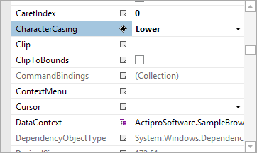
New built-in property editors for FontFamily, FontStretch, FontStyle, and FontWeight type properties have been added.

PropertyGridFontFamily

ProductHeadingWPFRibbon

New key tip specific theme resources have been added and key tips in Metro themes now render more like Office 2013.

CheckBox-based menu items now are capable of supporting tri-state display.

ProductHeadingGenericSyntaxEditor

Delimiter auto-completion logic for insertion and subsequent scope tracking has been greatly improved.  Delimiter indent provider can now optionally support square braces.

Added a new property that allows SyntaxEditor to measure itself based on text contents.  This works great for smaller documents in both multi-line and single-line modes.

SyntaxEditorAutoSize

Updated single-line mode to support word wrap, which is very useful when combined with the new view line measuring option.

SyntaxEditorSingleLineWrapped

Bookmark indicators now support an IsEnabled state.

LipsumGenerator class added to support generation of "lorem ipsum" placeholder text.

Changed block indent mode to retain whitespace after the caret when Enter is pressed.

.NET Languages Add-on

Numerous improvements to the VB language's handling of identifiers and variable declarations that don't include a type.

Web Languages Add-on

Added IntelliPrompt completion for keywords and symbols to the JavaScript language.

JavaScriptCompletion

Added a new advanced JSON language that can be used to view/edit JSON files, along with a new related QuickStart.

JsonLanguage

Updated JavaScript language to support multi-line strings via backslash continuation.

ProductHeadingWPFThemes

Many improvements to Metro themes (mostly in the Docking/MDI area described above), and improved WindowChrome (and RibbonWindow) rendering when maximized.

ProductHeadingGenericShared

WPF/Silverlight Only

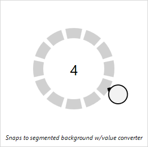
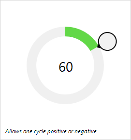
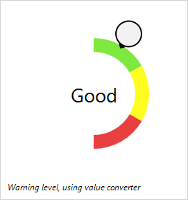
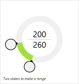
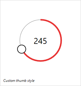
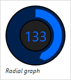
Added the RadialSlider control, which is a circular slider that can be used to input any scalar value.

RadialSliderIntro

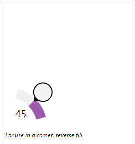
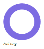
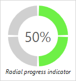
Added the RingSlice control, which renders a portion of a ring at designated angles and radius.

RingSliceProgressIndicator

Added the CircularThumb control, which is a thumb gripper with a circular shape and arrow adornment.

Added three samples for new Shared Library controls.

WinRT/XAML Only

Added the AppBarHint control, which is a visual hint to users that app bars exist on a page, and can be tapped to toggle them open. 

AppBarHint

Added a related QuickStart.

ProductHeadingMisc

Sample Browser (WPF/Silverlight only)

Added the ability to toggle description sidebar on some samples.

TaskDownload TaskLiveDemo TaskBuyNow

AppBarHint Control for WinRT/XAML

by Avatar Bill Henning (Actipro)
Friday, February 28, 2014 at 1:39pm

BlogPostBanner

We're including a helpful new control in the upcoming 2014.1 version of our WinRT/XAML Controls:  The AppBarHint control.

What is an App Bar Hint?

The AppBarHint control makes it easy to inject an ellipses (three dot) area at the bottom of an Windows Store app page that can be tapped by the end user to display the page's app bars.  Here's a screenshot showing what it looks like:

AppBarHint

Just dock the AppBarHint at the bottom of the page, set a background, and that's all there is to it.  The control automatically opens the app bars when it is tapped.

AppBarHint is also a ContentControl so that custom content can be inserted to the left of the ellipses if desired.

Real-World Usage

We already use the AppBarHint control in our free Code Writer app.  You can see it here in the lower left.

CodeWriterAppBarHint

In this usage scenario, we insert the line/column information as content within the AppBarHint control.  Then when the user taps anywhere inside of the green hint, the app bars display.

Summary

This new control will be available when the 2014.1 version of our WinRT/XAML Controls versions are released in March.

TaskDownload TaskLiveDemo TaskBuyNow

WinRT XAML Controls 2013.2 Released

by Avatar Bill Henning (Actipro)
Tuesday, October 22, 2013 at 10:57am

WinRTBlogPostBanner

The Actipro WinRT XAML Controls 2013.2 have been released and are now ready for download.  This version adds a complete port of our SyntaxEditor control and related add-ons, and also adds a number of new controls to existing products.

Major new features are described below.  See the announcement post for the detailed list of enhancements and updates.

A new WinRT XAML Studio bundle option is available that includes SyntaxEditor, Charts, Micro Charts, and our Shared Library.  The pricing saves you 40% over purchasing those products individually!  Best of all, once you have an active WinRT XAML Studio subscription, you will receive any new control products added to the bundle for free while your subscription is active.

If you are an existing customer of our individual WinRT/XAML controls and would like to switch to studio bundle at a discounted price, please contact our sales team.

ProductHeadingGenericSyntaxEditor

SyntaxEditor Control

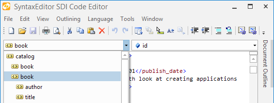
Our SyntaxEditor control is fully ported and now is available for use in WinRT/XAML apps!  This code editor control lets you make any sort of IDE, script, or expression editor app.

SyntaxEditorSDIEditor

SyntaxEditor is a powerful text editing control that is packed with features for efficient code editing, including syntax highlighting, code outlining, parsing, line numbers, block selection, IntelliPrompt UI, zooming, adornments, single-line mode, and much more. It is built on top of our next-generation extensible text/parsing framework and has many of the same code editing features found in the Visual Studio code editor.  The WinRT/XAML version shares a codebase with the WPF and Silverlight versions of SyntaxEditor, making it easy to transition code between platforms.

Now you can build your own apps, just like our free Code Writer app in the Windows Store.

LL(*) Parser Framework

The LL(*) Parser Framework is Actipro's own framework for constructing robust text parsers that work standalone or with code editor controls like SyntaxEditor. The framework features grammars that are written in C#/VB using EBNF-like notation, customizable AST construction, advanced error handling/reporting, easy code injection, a complete debugger UI, and much more.

The framework is included with the SyntaxEditor control for WinRT/XAML.

.NET Languages Add-on

The SyntaxEditor .NET Languages Add-on is an optional add-on that provides automated IntelliPrompt completion lists, parameter info, quick info, code snippets, code outlining, parsing, AST construction, syntax error reporting, a resolver, formatting, and more for C# and Visual Basic documents.

Web Languages Add-on

The SyntaxEditor Web Languages Add-on is an optional add-on that provides automated IntelliPrompt quick info, code outlining, parsing, AST construction, syntax error reporting, end tag auto-complete, formatting, and more for XML documents.  It also includes advanced JavaScript editing with code outlining, parsing, syntax error reporting, formatting and more.

ProductHeadingGenericCharts

PieChart

A new pie chart control has been added to complement our other bar, line, area, and scatter chart offerings.

Pie

The pie chart supports advanced features like multiple label positioning and display options, legend display, nesting of multiple series, hierarchical data, and more.

DonutChart

Donut

Donut charts have been added as well.  All the same features found in pie charts are found in donut charts, and the hole radius is fully configurable.

Axis Tick Labels for Percentage Stacked Charts

PercentageStackingChart

When using stacking bar or area charts with the percentage axis option, the percentage value labels now display on the axis.

Improved Scatter Chart Samples

ScatterChart

A new and improved scatter sample has been added.

Dark Theme Support

Dark themes are now fully supported out-of-the-box.

ProductHeadingGenericMicroCharts

Multiple Part Property Paths in XPath and YPath

The XY charts now allow multi-part property paths to be specified in their XPath and YPath binding values.

Dark Theme Support

Dark themes are now fully supported out-of-the-box for controls like box plot and candlestick.

ProductHeadingGenericShared

RadialSlider Control

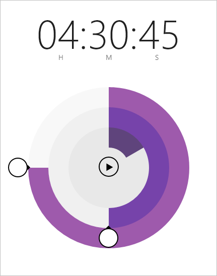
RadialSlider is a circular slider that can be used to input any scalar value.

RadialSlider

In the example above, a couple RadialSlider and RingSlice controls are combined to build a timer app.

RingSlice Control

RingSlice renders a portion of a ring at designated angles and radius.

RingSlice

The slice's start and end angles can be bound to any data and its appearance can be fully customized.  Make dotted lines, add different end cap styles, etc.

CircularThumb Control

CircularThumb is a thumb gripper with a circular shape and arrow adornment.  It is what the end user interacts with in a RadialSlider, as seen in the screenshot above.

TaskDownload TaskLiveDemo TaskBuyNow